
Last Updated: 1 year ago
Trying to sell a specialised software can be very tricky to do in an interesting way. One solution to this is to make a product walkthrough video. This is a type of explainer video that is used to make the item or service more accessible to the audience. Similar to the usage of animation in explainer videos, animated walkthrough videos have great benefits which include:
- Helping the viewer retain information
- making seemingly dull topic exciting
- demonstrating an abstract concept
- engaging audiences
The Challenge
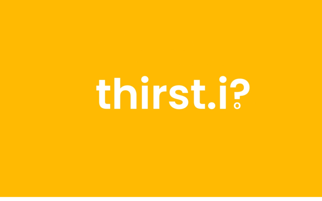
We were approached by Build Empire, a development company that specialises in eLearning software, to create this video with a unique brief. The client wanted us to produce an engaging, creative animation using existing brand assets for one of their latest developments: the Thirst.io platform. This software is a cloud-based authoring tool, which brings the editing power and flexibility of traditional desktop apps into the cloud. Our job was to come up with a way to add movement and intrigue to the provided assets and to develop other motion graphics to compliment the visuals.

Tone of Voice
In order to reach our goal, we used a direct and simple-to-understand- but at the same time, trustworthy – tone of voice. The text was straight-forward and instructive, read by a voice-over artist with a strong and confident tone. The simplicity and candor are reflected in the chosen animation style, while the information conveyed about the brand gives our client credibility and makes their product trustworthy.
Script
We designed a script to be professional and corporate, but with a touch of humour. The brand name, Thirst.io, was used as a touch of wordplay at the end of the video. We outlined the voice-over to describe the product, the benefits, and made sure to mention the designer, Build Empire, to add credibility. To round off the video, an endboard was created, to clearly communicate the call to action.
Animation Style
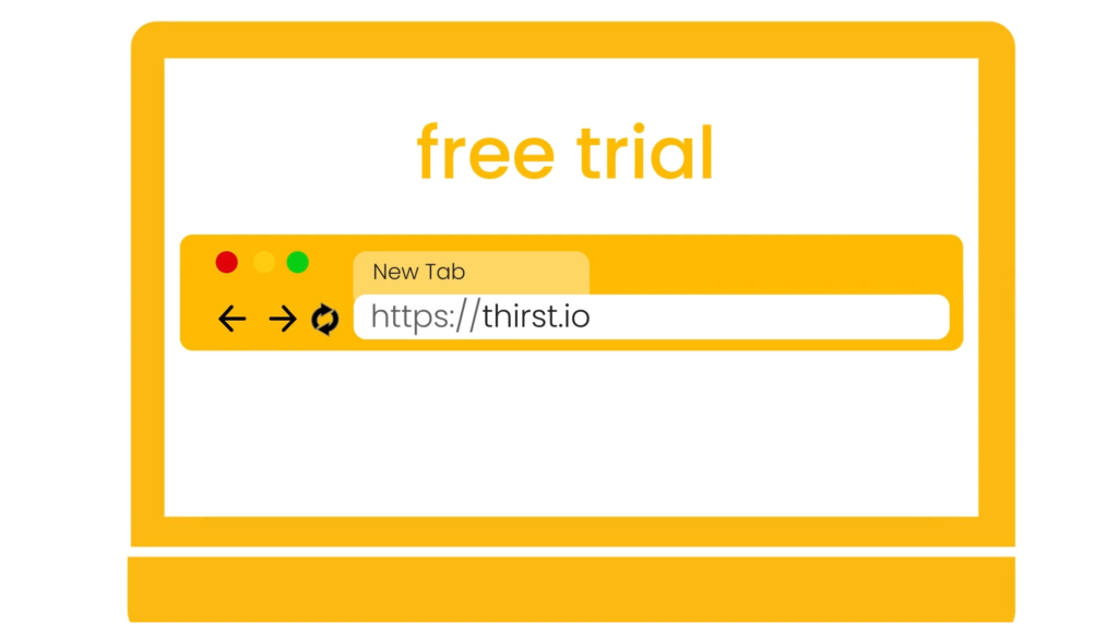
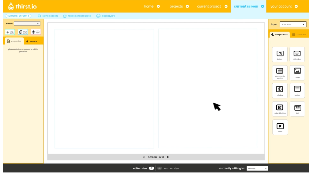
The animation style was designed in line with client’s branding elements. We used the dominant yellow brand colour in combination with white to drive brand recognition. The simple drawing style serves to underline the simplicity of the software, as well as to support the humorous approach. At the same time, the graphics represent the key elements of the message and showcase all the benefits of the platform. The screen on the animated computer shows the same screens that a user of the platform would see, walking the audience through the software in a clean-and-clear manner.
Audio
Aligned with a music track and voice-over, both elements were designed to compliment the visuals. The chosen music track is light-hearted but indistinctive, so it supports the voiceover and sets off a happy mood. The main focus of the audio lies on the voiceover. The artist has a charismatic, easy-to-understand voice, without any distinguishing dialect. The spoken message is complemented by written text in the video to bring across the key points.
Conclusion
Animation is a useful tool when it comes to explaining a concept. It helps to make any topic understandable by taking away the complexity and seriousness. The pleasant visuals take the viewer on an intriguing journey, all the while expanding upon a sales pitch.